The Ultimate Guide to High-Converting Landing Pages for Home Improvement Businesses
Most home improvement businesses send their advertising traffic to their main website homepage. That homepage attempts to serve multiple purposes: explain who you are, list all services, showcase projects, introduce the team, and accommodate various visitor intents.
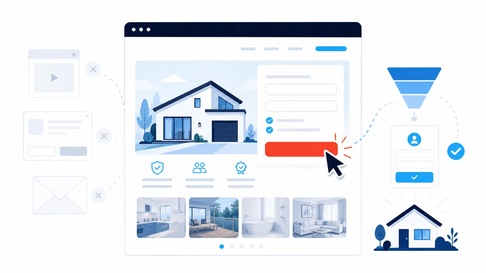
A landing page has one specific job: convert someone with a defined problem in a specific location into a phone call, quote request, or booking.
This focused approach is why dedicated landing pages typically outperform general websites when your objective is generating immediate bookings. When you direct Google Ads or social media traffic to a focused landing page with one clear action path instead of a homepage with navigation menus and multiple options, you remove friction and decision paralysis.
The conversion problem most businesses face isn’t insufficient traffic. It’s that traffic arrives at pages that don’t make fast action easy. Common barriers include:
- Slow page load times on mobile networks
- Phone numbers that are difficult to locate or not tap enabled
- Forms requesting excessive information before initial contact
- Generic messaging that doesn’t speak to the specific problem or location
- Lack of immediate trust signals (reviews, local proof, credentials)
This guide provides specific implementation steps for building high converting landing pages for home improvement businesses across categories including:
- Air conditioning (heating and cooling)
- Roofing and exteriors
- Pools and spas
- Kitchen renovation
- Solar and battery storage
The focus throughout is on generating calls, quote requests, and booked jobs, not aesthetic design for its own sake.
Why a Landing Page Outperforms a Generic Website for Immediate Bookings
Your main website serves multiple functions and audiences. It needs flexibility to accommodate various visitor intents and browsing patterns.
A landing page serves one visitor with one specific problem: someone in your service area who needs this particular service now.
This singular focus is why landing pages consistently convert better when you need work immediately.
Consider it like an organised job site:
- The work area is clear
- Tools are within immediate reach
- The path from vehicle to entry point is direct
The same principle applies to landing pages. You’re making it effortless for someone who’s already partially decided to complete the action.
What a Landing Page Must Accomplish in the First Mobile Screen
On mobile devices, the first screen determines most outcomes. You have seconds to establish clarity and make action easy.
Three elements must be visible without scrolling:
1. What You Do and Where You Do It
Clear service plus location identification:
- “Emergency electrical service in Norwood”
- “Blocked drain repairs in Brunswick”
- “Air conditioning repairs in inner-west Sydney”
A descriptive service plus location headline outperforms clever taglines consistently.
2. A Method to Take Immediate Action
- Tap to call button
- Brief quote request form
Both can appear above the fold. The essential element is that one action path is immediately obvious when the page loads.
3. Local Proof
- Star rating with actual names
- Brief testimonial
- Photo from a recent job in a nearby location
This establishes safety and legitimacy for making contact.
When the phone number is tappable, the form is brief, and the location appears in the headline, visitors stop searching and start booking. You also filter out enquiries from areas you don’t service.
The Essential Building Blocks You Can Implement Today
1. A Promise-Driven Headline
Your headline isn’t a brand slogan. It’s a promise addressing a problem:
- “Same-day air conditioning repair in Brunswick”
- “Licensed roof leak repairs in Norwood”
- “Pool equipment repairs in inner-west Sydney”
You’re identifying:
- The solution
- The location
This removes mental effort for the visitor.
2. A Plain-Language Expectation Line
Directly beneath the headline, add one brief line establishing expectations:
- If you charge a service call fee, state it
- If you have minimum project values for renovations, state it
Examples:
“Service calls from $149 weekdays, including first 30 minutes on site.”
“Projects from $25,000. Designed for complete kitchen remodels, not minor repairs.”
This simple line filters out unsuitable enquiries before they make contact.
3. Clear, Specific Calls to Action
“Call now to book today” performs better than generic “Submit” buttons.
On every landing page, include:
Primary action: Tap to call button
Secondary action: Brief form
On the form, request only what you need to return the call and qualify:
- Name
- Phone number
- Location
- Brief description (“Tell us what’s happening”)
To reduce unqualified enquiries:
- Display your minimum service fee or “from” pricing near the button
- Let the copy do the filtering, not additional form fields
Add a photo upload option if it genuinely helps you assess the job (electrical panels, leaks, roof damage), but don’t make it mandatory.
4. Local Proof in the Page Middle
Midway through the page, visitors seek reassurance. Provide:
- Brief reviews mentioning the location or job type
- Before and after photos with one or two line captions
- First name plus initial and location
Example:
“Arrived on time and resolved our noisy outdoor unit in one visit. Sarah M., Brunswick”
For larger projects, one focused before and after with three lines of context is sufficient. Visitors scan rather than study extensively.
5. Licences, Insurance, and Accreditations
Display compliance credentials where eyes naturally pass on the way to the action button.
Examples:
- Relevant licensing body logos (QBCC, VBA, Energy Safe, CEC)
- Licence numbers in readable but unobtrusive text
If you operate across multiple jurisdictions, clarify which licences apply where and any location specific registrations.
This isn’t about creating a logo wall. It’s about a clean credential strip that communicates legitimacy.
6. Simple Pricing Guidance
Visitors don’t expect comprehensive price lists. They want reasonable parameters.
Provide:
- “Weekday service calls from $X in [area]”
- “Free quotes for complete kitchen renovations over $X”
- “Air conditioning service from $X per unit”
This reduces:
- Extended phone negotiations
- “How much?” email exchanges
- Shocked reactions when you finally provide a quote
You’re not committing to fixed pricing. You’re providing a realistic starting point.
Design and UX Decisions That Improve Conversion
Make Mobile the Default Design Standard
Most home improvement traffic originates from mobile devices. Design for phones first, not desktop computers.
- Single column layout
- Generous spacing between elements
- Large touch targets for buttons and links
Complex layouts can wait. Clarity takes priority.
Keep the Form Painless
Small form design details create substantial completion rate improvements:
- Labels positioned above fields, not inside them
- Input fields sized appropriately for thumb input
- Location field with a dropdown of your core service areas to prevent typos
If you implement a calendar widget:
- Display only genuine availability
- Don’t allow bookings for times you can’t honour
Remember: the objective is starting a conversation, not building a medical style appointment system on day one.
Monitor Load Time
If the page loads slowly on mobile networks, visitors abandon.
- Compress images appropriately
- Avoid heavy autoplay video at the top
- If you want video content, position it lower with a static preview image
A clean, fast page outperforms an attractive but slow one consistently.
Remove Distractions
Navigation links leak attention and create exit points.
- Remove top navigation if possible
- If you must link back to your main site, make it subtle
- Reserve external links for after the enquiry
Right now you’re helping people complete the action, not encouraging browsing.
Write Like You Speak on the Phone
Short sentences. Clear steps. Local terminology where appropriate.
You don’t need to sound like a marketing agency. You need to sound like the person they’ll meet at their property.
Service-Specific Implementation Guidance
Air Conditioning: Temperature Emergencies and Malfunctions
Lead with the symptom and location:
- “Air conditioning not cooling in Norwood?”
- “No heating in Brunswick?”
On the page:
- Display a photo of a professional outdoor unit or indoor installation
- Mention same day or next day availability if you offer it
- Provide simple “from” pricing for service or diagnostics
- Offer two time windows (“Today 3 to 5 PM” or “Tomorrow morning”)
If you handle both repair and split system installation:
- Create separate landing pages
- One for “air conditioning repairs in [area]”
- One for “new system installations in [area]”
This ensures calls route to the appropriate person and expectations are clear.
Roofing and Exteriors: Leaks, Damage, Storms
Visitors care about:
- Active leaks
- Missing tiles or sheets
- Storm damage and emergency patching
Headline examples:
- “Roof leak repairs and emergency tarping in Norwood”
- “Storm-damaged tile and metal roof repairs in Brunswick”
On the page:
- Use photos showing professional safety practices or completed repairs
- Briefly explain your safe roof access procedures
- Include a “roof inspection from $X” line addressing the common first question
Avoid only using aerial shots of large properties. Most visitors simply want their specific leak resolved.
Pools and Spas: Water Quality, Safety, and Timing
Pool and spa visitors worry about:
- Water clarity and chemistry
- Safety for children and pets
- Resolution before weekends or holidays
Ensure the page:
- Positions your phone number prominently
- Shows a clean, real pool in a typical local setting
- Requests: name, phone, location, brief description, and (optionally) equipment brand
You can list brands you service further down, but keep the first screen focused on:
“We resolve cloudy, green, or noisy pools in [area cluster].”
Kitchen Renovations: Qualifying the Right Projects
A kitchen landing page should focus on one primary objective:
- Book a design consultation, or
- Qualify enquiries for projects above your minimum value
Determine which, then build around it.
On the page:
- State your minimum project value
- Explain what’s included in the first step (for example, a paid consultation with design concepts, or a free discovery call)
- Show a simple before and after with:
- Location
- Style (for example, “light, contemporary kitchen in Adelaide”)
- One line result summary
Keep the form brief. People investing tens of thousands still want to speak with someone. Allow them to choose “Call me” versus “Email me” if that suits your workflow.
Solar and Battery Storage: Comparison and Clarity
Solar and battery visitors are actively comparing options. Lead with:
- Location relevant social proof
- Professional accreditation
On the page:
- State relevant certifications where applicable
- Show one recent installation with:
- System size (for example, 6.6kW)
- Roof type
- Brief before and after electricity bill impact in plain language
Request:
- Name
- Phone
- Location
- Whether the property is single phase or three phase (if this commonly affects installation in your area)
Reserve deeper questions about equipment brands, tariffs, and roof conditions for the follow-up conversation.
Local Signals That Create Immediate Recognition
Local cues build trust rapidly.
Use location names early:
- In the headline
- In the first paragraph
- In at least one review
Mention regional terminology naturally:
- “Inner suburbs”
- “Eastern suburbs”
- “Northside” and “Southside”
Be transparent about your service area:
“Based in Brunswick, servicing 3 to 5 core locations and nearby areas.”
Better to appear clearly local than to claim nationwide coverage.
Photos should resemble your customer’s neighbourhood:
- Use actual properties from your service area
- Avoid generic stock imagery
- Focus on professional work, clean execution, and safe practices
Testimonials should sound conversational, not scripted:
“Arrived punctually, explained the options clearly, and cleaned up completely. David P., Norwood”
If your Google reviews already contain strong testimonials for specific services, mirror one or two on the page so the messaging stays consistent.
If you serve multiple locations:
- Start with one strong page per service
- Add location variations over time
- Keep the structure similar and change the location specific references and proof
The Two Moments That Determine If the Page Generates Return
1. The Tap
If your call button is hidden or your phone number is embedded in an image, you’re losing calls.
Fix it by:
- Using a genuine, clickable phone number
- Making the call button large, high contrast, and clearly labelled (“Call now for today’s availability”)
- Repeating it at:
- The top
- Near your review section
- Near the end
2. The Response
The most effective landing page can’t compensate for slow follow-up.
Two critical practices:
Configure your form to:
- Send you an immediate alert
- Trigger a quick text identifying your business and offering a call window
Enable missed call text automation that:
- Identifies your business
- Acknowledges the call
- Invites a response with location and preferred time
Keep both messages transactional and clear so they comply with messaging regulations. You’re not running promotional campaigns. You’re completing the enquiry loop.
Integrating Google Maps and Local Search
Your landing page and Google Business Profile should work together.
Ensure:
- Business name, phone, and hours match exactly
- Service areas on your profile align with locations on the page
- Photos on the page and profile overlap (same projects where possible)
On the page itself:
- Use location and service terminology in the page title and meta description
- Repeat that terminology naturally in the first few content lines
- Add call tracking to your ad links (for example, UTM tags, which are small bits of text added to a web address so you can see which ad a visitor came from) so you can identify:
- Which campaigns generated calls
- Which landing pages produced completed forms
When someone moves from Google Maps to your page and sees consistent photos, tone, and details, trust increases and hesitation decreases.
What to Do If You’re Starting From Zero
You don’t need a comprehensive system of pages. Start with one page for one service.
Examples:
- “Blocked drain repairs in [area cluster]”
- “Air conditioning repairs in inner-west Sydney”
- “Roof leak repairs in Norwood”
On that page include:
- Clear headline
- Tap to call button
- Brief form with four fields
- Two authentic reviews
- Two authentic photos from local jobs
Enable:
- Missed call text coverage
- Fast responses to form submissions during business hours (aim for minutes, not hours)
Once that page generates a couple of additional jobs, you can:
- Clone the structure
- Modify for a different service or location group
- Refine the images and copy
The first objective isn’t perfection. It’s a booked job this week.
What to Measure Without Overwhelming Yourself
Three metrics are enough to evaluate whether a landing page is performing:
Time to first response: How long between a form submission or missed call and your first meaningful response (call or text)?
Calls and forms per 100 visits: Out of every 100 visitors, how many contact you?
Booked jobs from those contacts: Of the people who reach out, how many convert to paid work?
Record these weekly.
If the numbers plateau or decline, change one element at a time:
- Shorten the form
- Position the call button higher
- Replace the hero photo with something more locally relevant
- Add clear “from” pricing next to the button
A common quick improvement:
- Reduce the form from a long questionnaire to four fields
- Pair it with a clearer button (“Schedule a call about your [service] in [area]”)
- Add one local review above the fold
Most pages don’t need complete redesigns. They need focused refinement.
Your Implementation Path
A high converting landing page isn’t artistic expression. It’s a clean, honest pathway from “I need help in this area” to “I’ve booked you”.
When your headline identifies the solution and location, your phone number is tappable, your form is brief, and your proof feels local, enquiries stop stalling.
When your responses are fast and useful, those enquiries become jobs.
Start with one service page this week:
- Clear promise
- Clean mobile layout
- Authentic photos and reviews
- Simple form and obvious call button
- Fast follow-up configured
In two weeks you’ll know if that page is generating results. If it is, replicate the pattern for your other services and locations. If it isn’t, remove clutter, sharpen the promise, and adjust one element at a time.
That’s how you convert clicks into calls, and calls into booked work, without wasting time or budget.
How Local Demand Partners Can Help
A landing page is where ad spend either turns into booked jobs or quietly leaks away. At Local Demand Partners, we build fast, local, mobile first landing pages for home improvement businesses, then wire up the call tracking and follow-up that turns enquiries into work. If you’d like pages built and tested for you rather than figuring it out alone, we can take it off your plate.
Book your Free Growth Call